When the good people at Owl Hollow Press sent me a handful of cover designs to choose from, I was bowled over.
Me? Choose a cover? Eep! With my other books, I had no input, so this was a huge change. And a little intimidating.
Each sample was beautiful and arresting in its own right, making it difficult to choose. I showed the samples to my husband and kids, then to my trusted writing buddies. Their comments were varied and fascinating, each person having a different takeaway from the images. Keeping their opinions in mind, I went with my gut and chose, indicating some changes I thought would make it better. Then came time for the font! Ei yi yi. Back to my family again, and also to a very accomplished artist. Still more interesting takes. Here is why I chose what I did:
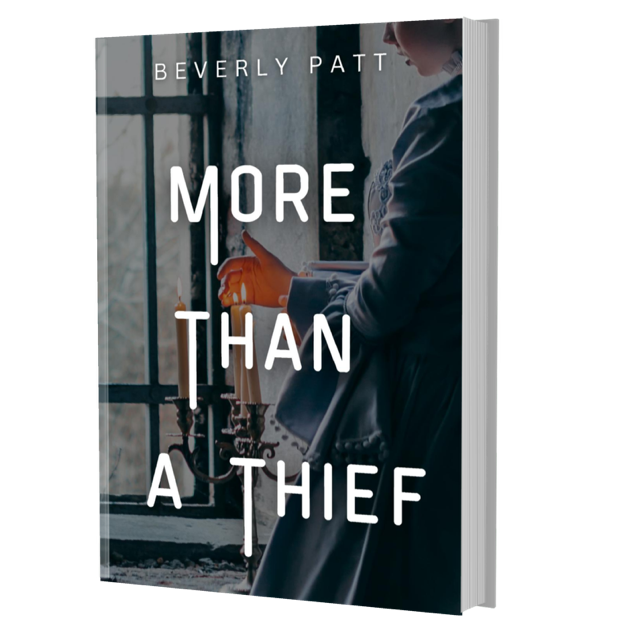
Photo: The darkness and partial view of the girl invoke a feeling of mystery. The spot of color is the hand, almost red from the heat of the candle – what better way to symbolize a thief than emphasize the hand that steals?
Font: Unusual, maybe a little menacing, and surprising on a historical fiction cover. Will it make a potential reader pick it up? I hope so!
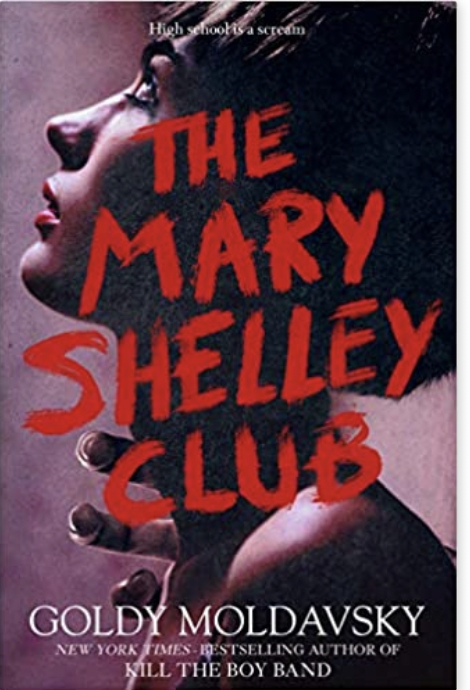
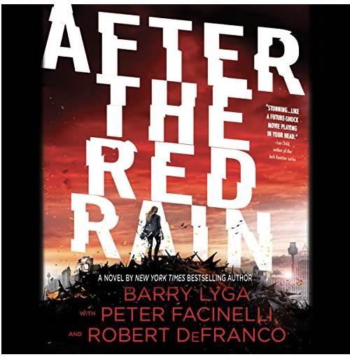
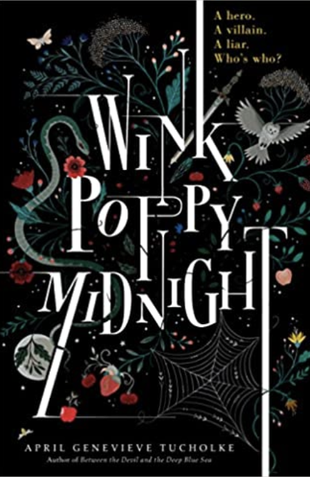
Here are a few covers whose font and artwork combinations I found evocative:
How about you? Do you have a favorite cover that caught your eye? Please share!